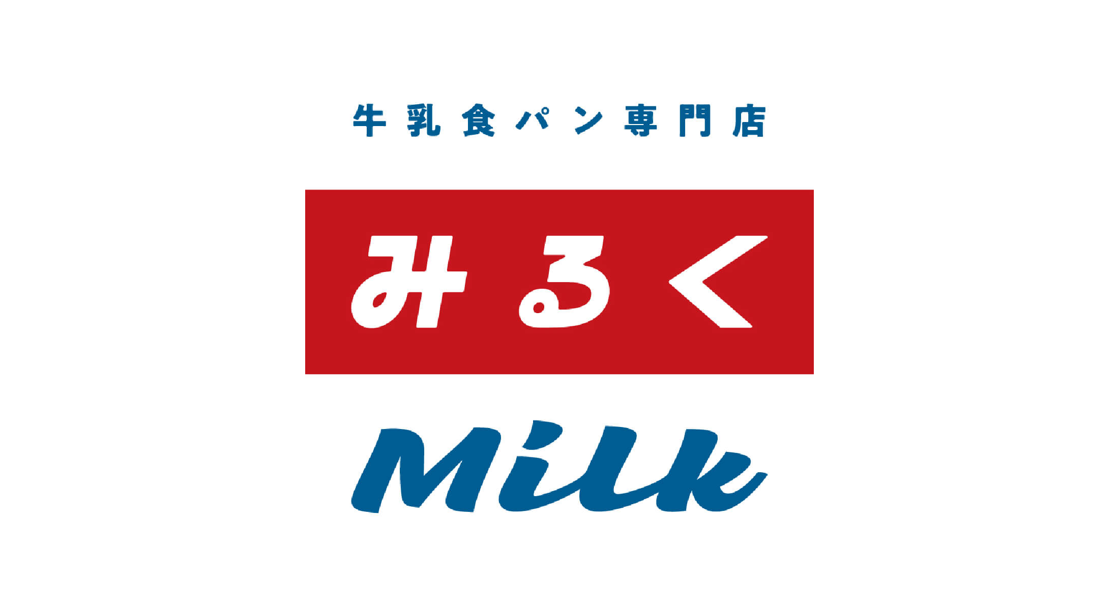
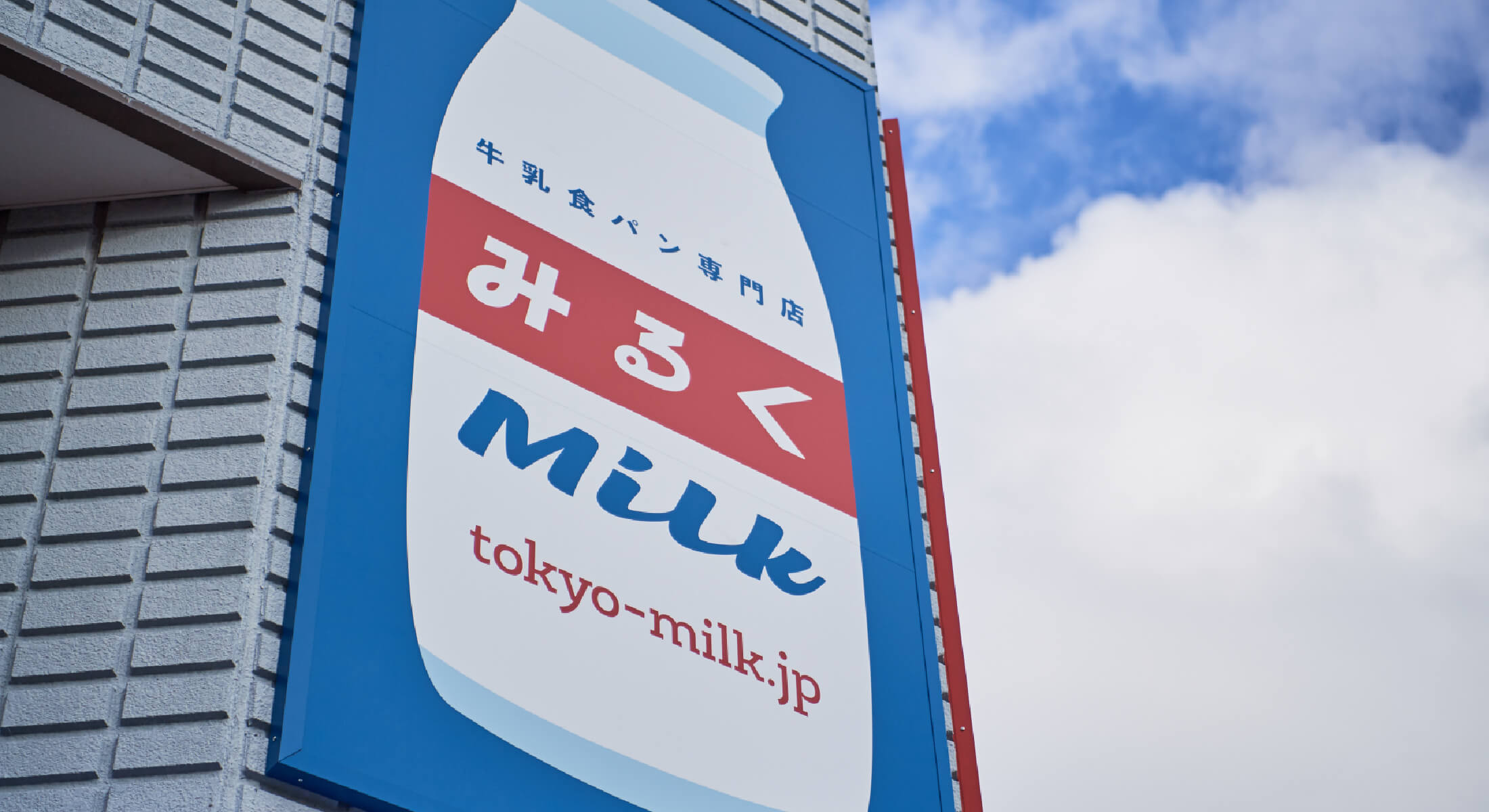
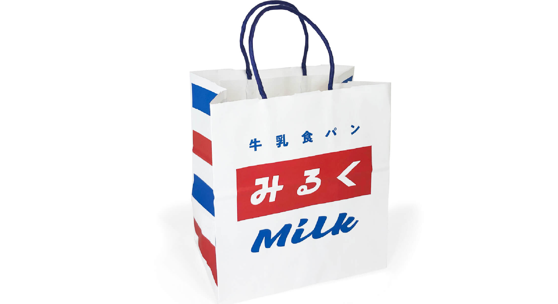
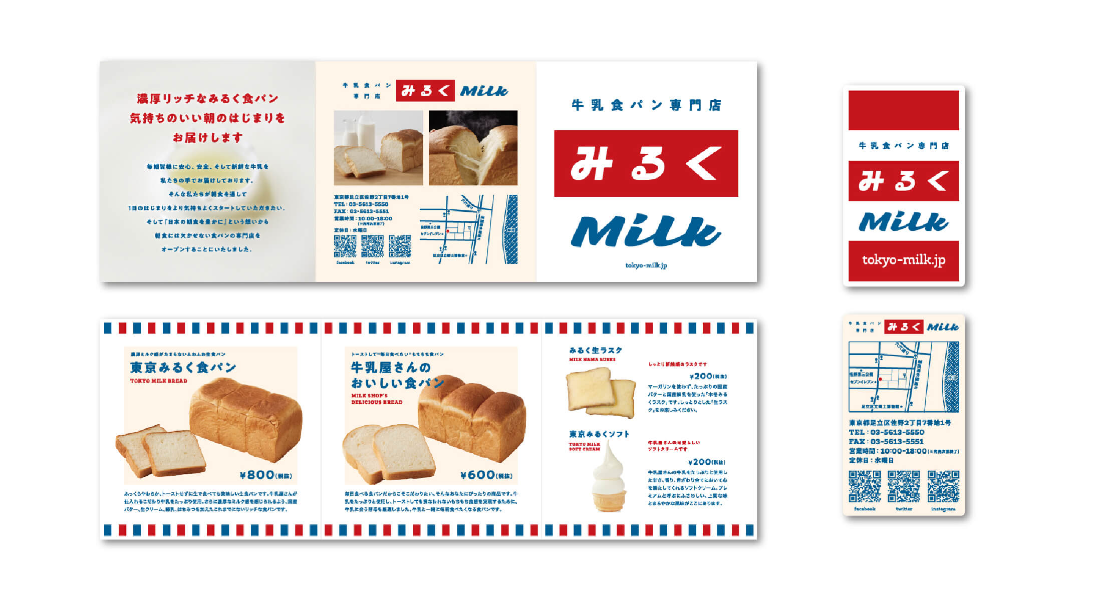
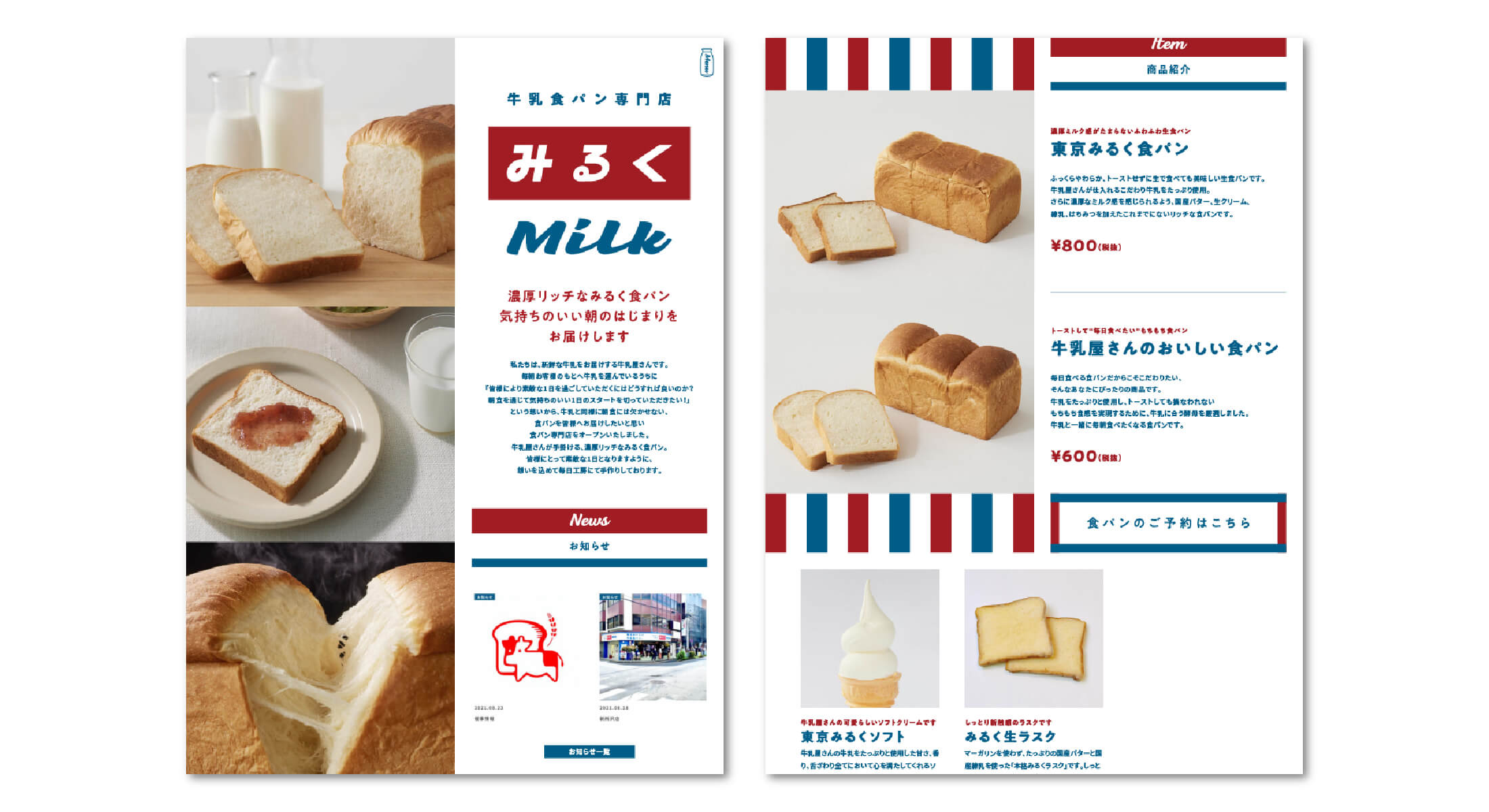
牛乳食パン専門店 みるく

町の牛乳屋さんが手掛ける、濃厚リッチな牛乳食パン専門店。 食パンは全て水ではなくたっぷりの牛乳を使用。赤と青の目を引くカラー展開と、レトロさを感じさせるロゴ・ツール・店舗などのブランディングを中心にデザインを統括。
A rich and creamy milk shokupan specialty shop created by a local milk delivery business. All of the bread is made using milk instead of water. The branding—centered on eye-catching red and blue colors along with a retro-inspired logo, packaging, and store design—was directed to reflect a nostalgic yet vibrant identity.